Testing various ML models in heart disease prediction
An intro to basic ML for beginners.
This is a quick practical tutorial for beginners on using ML models to predict outcomes of heart disease, in Python. The dataset was obtained from Kaggle. It had 299 observations and 13 variables.
Heart failure is at the end of the continuum of heart disease and eventually leads to death. There are various conditions and risk factors that increase the probability of a poor prognosis for people with heart disease. In this tutorial, some of these risk factors would serve as predictor variables. the outcome variable 'DEATH_EVENT' indicates whether a patient died of heart failure or not based on 11 other predictors.
First, we'll load the required libraries:
import numpy as np
import pandas as pd
import matplotlib.pyplot as plt
import seaborn as sns
import plotly.offline as py
import plotly.express as px
import plotly.figure_factory as ff

from sklearn.feature_selection import VarianceThreshold
from sklearn.model_selection import train_test_split
from sklearn.metrics import accuracy_score, precision_score,recall_score

from imblearn.over_sampling import SMOTE
from sklearn.svm import SVC
from sklearn.ensemble import GradientBoostingClassifier
from sklearn.ensemble import RandomForestClassifier
from sklearn.tree import DecisionTreeClassifier
from sklearn.neighbors import KNeighborsClassifier
from sklearn.linear_model import LogisticRegression
from mlxtend.feature_selection import SequentialFeatureSelector as SFS
The dataset can be downloaded from:
Heart Failure Clinical Data - Kaggle
This data has already been cleaned, which is quite unlike real-world data where most of the time and effort would be spent on cleaning and preparing the data. Let’s move ahead and check out the variable names:
data = pd.read_csv("C:/Users/pauli/Downloads/heart_failure_clinical_records_dataset.csv")
print(data.columns)
Output:
Index(['age', 'anaemia', 'creatinine_phosphokinase', 'diabetes',
       'ejection_fraction', 'high_blood_pressure', 'platelets',
       'serum_creatinine', 'serum_sodium', 'sex', 'smoking', 'time',
       'DEATH_EVENT'],
      dtype='object')
NB: The 12th variable 'time' indicated the time from the start of the study after which the study was terminated. This, presumably, could be either because the subject was declared healthy, dropped out of the study for various reasons, or died from heart failure. To avoid "target leakage", since that time would not be available in real-world instances when the resultant model is being used to predict the outcome of a new case, the 'time' variable would not be used as a feature to train the model.
Brief Exploratory Data Analysis
We can do a quick overview of the only two demographic variables from the dataset: age and sex. Here’s the code:
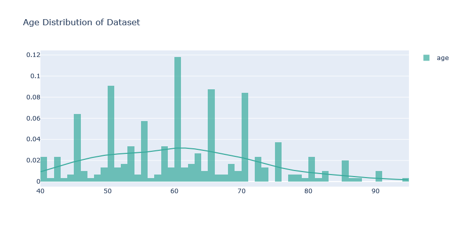
print(data['age'].describe())
Output:
count    299.000000
mean      60.833893
std       11.894809
min       40.000000
25%       51.000000
50%       60.000000
75%       70.000000
max       95.000000
Name: age, dtype: float64
From the output, we realize that the age range of the respondents is 40 to 95 years with a median age of 60 years and an average age of approximately 60 years. The age distribution will be better visualized. Here’s some code to produce a simple plot that would do that:
hist_data = [data["age"].values]
group_labels = ['age']

agedist = ff.create_distplot(hist_data, group_labels,show_rug=False, colors=['#37AA9C'])
agedist.update_layout(title_text = 'Age Distribution of Dataset')
Is there a gender balance?:
gendist = df['sex'].value_counts().to_frame().reset_index(level=0)
gendist.replace([1,0],["Male", "Female"], inplace = True)
genfig = px.pie(gendist, values = 'sex', names='index', title  = "Gender Distribution of Dataset" )
genfig.show()

Now we can also visualize the outcome variable ‘DEATH_EVENT’:
df = data
df["Mortality"] =  np.where(df["DEATH_EVENT"] == 0, "No", "Yes")
outcome = px.histogram(df, x= "Mortality", text_auto=True)
outcome.update_layout(bargap=0.5, title_text= "Count of Outcomes")
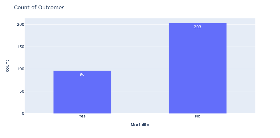
We can see that our outcome variable is imbalanced, i.e. it has more Nos than Yeses. This mimics real-world scenarios, and some data professionals would leave it as it is. Others might want to employ techniques such as Synthetic Minority Oversampling Technique (SMOTE) to create balance. We would apply SMOTE in this tutorial down the line and explain its purpose a little further.
Next, we compile the names of the predictor variables into a list called “Features” as we would use them as the features to train our model. We would then separate our data into training and test sets, with the conventional “80% in training and 20% in test set” approach.
x = data[Features]
y = data["DEATH_EVENT"]
x_train,x_test,y_train,y_test = train_test_split(x,y, test_size=0.2,shuffle=False)
Feature Engineering
We are closer to our goal of comparing the performance of various ML models on the dataset. First, let us check our outcome variable. In our dataset, the proportion of "No" examples for our outcome variable is much higher than the "Yes" examples. The main challenge with imbalanced dataset prediction is how accurately the ML model would predict both majority and minority classes. Thus, there is the danger of our ML algorithms being biased if trained on this data as they would have way more "No" examples to learn from.
We would solve this imbalance with some feature engineering with Synthetic Minority Oversampling Technique (SMOTE). SMOTE utilizes a k-nearest neighbour algorithm helps to overcome the overfitting problem that might occur if we use random oversampling.
I chose SMOTE instead of Random undersampling of the majority class because I want to preserve the data and not eliminate any examples since I do not have much training data, to begin with!
#We apply SMOTE only on the training set because we want the test set to not have any synthetic data (to remain just as it was taken from the real world).

smote = SMOTE(sampling_strategy = 'minority', random_state = 2)
x_SMOTE, y_SMOTE = smote.fit_resample(x_train,y_train)

#Visualization of training data before sampling technique
traindata = px.histogram(y_train, x= "DEATH_EVENT", color = "DEATH_EVENT", labels= {"DEATH_EVENT" : "DIED OF HEART FAILURE?, 1 = Yes. 0 = No."}, text_auto=True)
traindata.update_layout(bargap=0.5, title_text= "Count of Outcomes for Training Dataset")

# Visualization of training data after sampling technique
traindata_sampled = px.histogram(y_SMOTE, x= "DEATH_EVENT", color = "DEATH_EVENT", labels= {"DEATH_EVENT" : "DIED OF HEART FAILURE?, 1 = Yes. 0 = No."}, text_auto=True)
traindata_sampled.update_layout(bargap=0.5, title_text= "Count of Outcomes for Training Dataset after Sampling")


Feature Selection
Feature selection helps us choose the best features to train our models so we get a model with good performance.
First, we identify features with low variance since they would not help the model much in finding patterns and de-select them. A feature with low variance is one where almost all the data under the variable is the same. Example: The variable “Sex” having 90% of its data as “Female” means this variable has low variance. We will also check if there is multicollinearity amongst any of the features and we de-select one per pair. Collinearity is when two or more predictor variables are highly correlated with each other. The presence of collinearity can make it difficult to separate the individual effects of collinear variables on the outcome. An example of collinear variables could be “Weight” and “BMI”, since weight is already included in the calculation of BMI!
var = VarianceThreshold(threshold = 0.15) # arbritary percentage of 15% for the minimum variance to be allowed. Thus, features with values sharing a similarity of 85% and above  would be dropped.
var.fit(x_SMOTE)
var.get_support()
Output:
VarianceThreshold(threshold=0.15)
array([ True,  True,  True,  True,  True,  True,  True,  True,  True,
        True,  True])
From the results, per our threshold criteria, all the features have high variance (< 85% similarity amongst values).
cor = x_SMOTE.corr()
cor
sns.heatmap(cor)

The heat map shows that there is no collinearity among the variables.
Now, we're going to use SequentialFeatureSelector(SFS) from the mlxtend library, which is a Python library of data science tools. SFS is a greedy procedure where, at each iteration, we choose the best new feature to add to our selected features based on a cross-validation score. For forward selection, we start with 0 features and choose the best single feature with the highest score. The procedure is repeated until we reach the desired number of selected features. We will use the “best” option, where the selector returns the feature subset with the best cross-validation performance.
sfs = SFS(LogisticRegression(max_iter = 1000), #the default max_iter of 100 was not enough for the algorithm to converge
          k_features= 'best',
          forward= True,
          scoring = 'accuracy')

sfs.fit(x_SMOTE,y_SMOTE)
sfs.k_feature_names_
Output:
SequentialFeatureSelector(estimator=LogisticRegression(max_iter=1000),
                          k_features=(1, 11), scoring='accuracy')
('age', 'anaemia', 'creatinine_phosphokinase', 'diabetes', 'serum_creatinine', 'ejection_fraction')
From our 11 features, SFS has chosen the 6 best features based on accuracy. Now before we proceed, let's do a little experiment and see which features are selected when we use the raw data before SMOTE was applied:
sfs2 = sfs
sfs2.fit(x, y)
sfs2.k_feature_names_
Output:
SequentialFeatureSelector(estimator=LogisticRegression(max_iter=1000),
                          k_features=(1, 11), scoring='accuracy')
('age', 'serum_creatinine', 'sex', 'smoking', 'ejection_fraction')
The results are different. We see the importance of data pre-processing and feature engineering before rushing ahead with machine learning. We will go ahead with the features selected from the SMOTE-transformed data.
The following chunk of code creates a function we can use to train various models and collate their metrics since we will be testing out different models and it would not be wise to rewrite similar lines of code over and over:
x_SMOTE  = x_SMOTE[list(sfs.k_feature_names_)]
x_test = x_test[list(sfs.k_feature_names_)]

accuracy_dict = {}
precision_dict = {}
recall_dict = {}

def model(arg):
    """ Train the specified machine learning model "arg" on the training set, and then apply on the test set to make predictions, check for its accuracy, precision and recall scores, and append the metric scores to existing dictionaries.
    Args:
        arg: a variable that holds an instance of the function call of a specified machine learning model.
    Returns:
        An instance of itself
    """
    arg.fit(x_SMOTE, y_SMOTE)
    arg_pred = arg.predict(x_test)
    arg_acc = accuracy_score(y_test, arg_pred)
    arg_prec = precision_score(y_test,arg_pred)
    arg_rec = recall_score(y_test,arg_pred)
    accuracy_dict.update({'{}'.format(arg): 100*arg_acc})
    precision_dict.update({'{}'.format(arg): 100*arg_prec})
    recall_dict.update({'{}'.format(arg): 100*arg_rec})
    pass
Okay, now we can train 6 popular ML models and compare their performance on this dataset.
log_reg = LogisticRegression(max_iter = 1000)
model(log_reg)
#Support Vector Machine
svc = SVC()
model(svc)
#K Neighbours Classifier
knn = KNeighborsClassifier()
model(knn)
#Decision Tree Classifier
dt = DecisionTreeClassifier()
model(dt)
#RandomForestClassifier
r = RandomForestClassifier()
model(r)
#GradientBoostingClassifier
gb = GradientBoostingClassifier()
model(gb)
The following is just to create a dictionary of each model as the key and its metrics as the values.
indices = [0,1,2,3,4,5]
dictlist = [accuracy_dict,precision_dict,recall_dict]
models = list(accuracy_dict.keys())
val = []
for item in dictlist:
    val.append(list(item.values()))
metrics = [[],[],[],[],[],[]]
for ind in indices:
    for it in val:
        metrics[ind].append(it[ind])
model_dict = dict(zip(models,metrics))
print(model_dict)
Output:
{'LogisticRegression(max_iter=1000)': [78.33333333333333, 14.285714285714285, 66.66666666666666], 'SVC()': [83.33333333333334, 23.076923076923077, 100.0], 'KNeighborsClassifier()': [86.66666666666667, 22.22222222222222, 66.66666666666666], 'DecisionTreeClassifier()': [68.33333333333333, 5.555555555555555, 33.33333333333333], 'RandomForestClassifier()': [86.66666666666667, 22.22222222222222, 66.66666666666666], 'GradientBoostingClassifier()': [86.66666666666667, 22.22222222222222, 66.66666666666666]}
Converting the dictionary into a data frame for better visual exploration of models and their metrics.
df= pd.DataFrame.from_dict(model_dict, orient = 'index', columns= ["Accuracy","Precision","Recall"])
df = df.reset_index(level=0)
df
Output:
                               index   Accuracy  Precision      Recall
0  LogisticRegression(max_iter=1000)  78.333333  14.285714   66.666667
1                              SVC()  83.333333  23.076923  100.000000
2             KNeighborsClassifier()  86.666667  22.222222   66.666667
3           DecisionTreeClassifier()  68.333333   5.555556   33.333333
4           RandomForestClassifier()  86.666667  22.222222   66.666667
5       GradientBoostingClassifier()  86.666667  22.222222   66.666667
We could visualize the metrics above:
fig1 = px.bar(df, x= "index", y = "Accuracy", title = "Accuracy of the ML models", labels = {'index':'ML models'}, text_auto=True)
fig1.show()
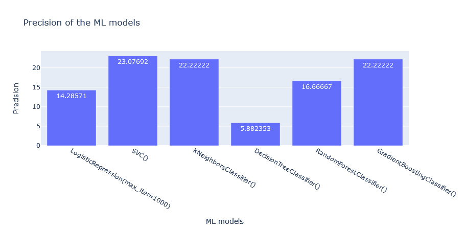
fig2 = px.bar(df, x= "index", y = "Precision", title = "Precision of the ML models", labels = {'index':'ML models'}, text_auto=True)
fig2.show()
fig3 = px.bar(df, x= "index", y = "Recall", title = "Recall of the ML models", labels = {'index':'ML models'}, text_auto=True)
fig3.show()


From the above, how do we choose the best model for this problem?
Accuracy: Calculates the overall proportion of correct predictions whether positive or negative. Top 3 based on Accuracy: GBC, KNN, SVC
Precision: Precision is a metric used to calculate the quality of positive predictions made by the model. It attempts to answer the question: What proportion of identifications was correct?/ How many of the returned hits were true positives: TP/(TP+FP) Thus a model that produces no false +ves has a precision of 1.0 Top three: GBC, KNN, SVC (poor overall though)
Recall: Recall is a metric used to calculate how many of the true positives were recalled(found). It attempts to answer the question: What proportion of actual positives was identified correctly?: TP/(TP+FN) Thus a model that produces no false negatives has a recall of 1.0. A recall of 69.77% means it accurately identifies 69.77% of all those who died of heart failure. Top three: SVC, GBC, KNN, Logistic Regression
From the results, the Support Vector Machine model correctly identifies all who died of heart failure, based on its recall score. However, its precision, though in the top three for this problem, is still poor. That means a high number of those who did not die of heart failure were tagged by the model as having died of heart failure. This model got all those who died of heart failure correctly but included many of those who didn't as well.
From a medical viewpoint, if we could not get any better, we would probably go with this model since we would rather not miss anyone who would die of heart failure if an intervention is not made. It seems to be the best of the options we have here. Thus we would rather err on the side o caution even if it includes those who would not die of heart failure. For real-world use though, this model is not strong enough because of its poor precision.
We would build on these concepts in subsequent tutorials and eventually look at how to deploy our dummy model in a webapp. Thank you and happy coding!

